January 26, 2021
Data Visualization Types
One of the most fundamental benefits of Business Intelligence platforms is the ability to incorporate graphical visualizations into reports. While there are many different types of visuals to use, selecting the best one can make the data much easier to analyze and understand.
KPI
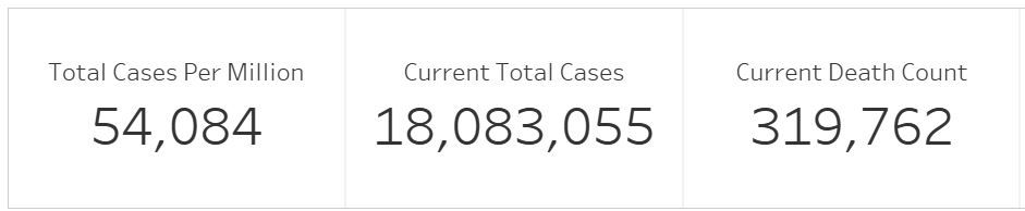
Key performance indicators (or KPI) are not technically a graphical visualization, but they are still a great way to bring home important data points. Typically presented via a large/bold font along the top of the right side of a dashboard, these numbers catch the eye of the viewer and immediately provide context for the rest of the visuals.
Line graph
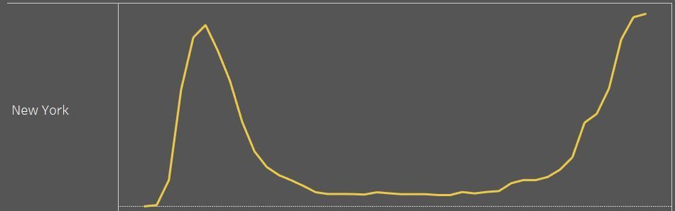
One of the simplest and most common forms of visualization is the line graph. Often these are the first forms of graphing that we learn in school. The main purpose is to display a trend line of the data over the course of time. There are some variations of line graphs that can add more impact to the design: an Area Graph , which fills in the space below the line, can be useful if there are multiple lines on the same graph and a Sparkline , which is a line without the X or Y axes, works well with a KPI to give the viewer a quick context of the trend.
Bar
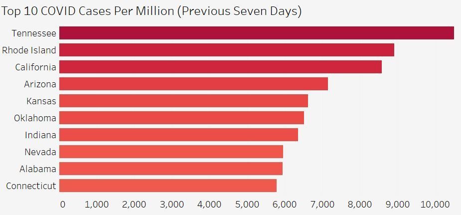
Another of the more basic forms of graphics is the bar chart. These are useful when comparing values between discrete categories. With a quick glance, the viewer can easily discern the highest/lowest members of the group. If you have subcategories to go along with your main categories, a stacked bar chart can be leveraged to add that detail.
Histogram
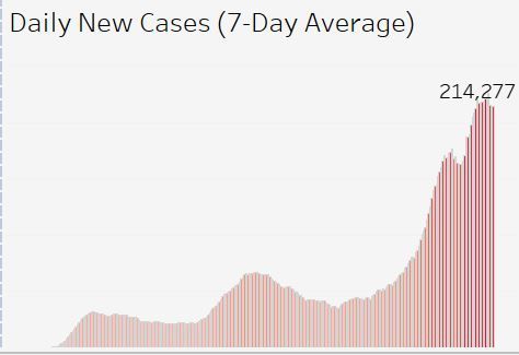
A histogram is similar to a bar graph with one key difference: Bar charts are great for measuring discrete categorical datapoints, such as sales revenue by department, while a histogram is used to measure the distribution of those datapoints by a continuous dimension, such as sales by hour of the day.
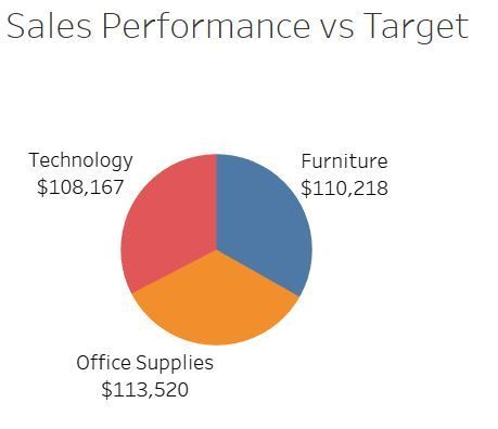
Pie Chart
Although limited in practicality, pie charts are another common form of visualization. These are typically used to convey the proportion to the whole of a single category. Unfortunately, its shortcomings typically make it an inferior choice to other types of visuals, such as a bar chart. Specifically, if there are more than a handful of datapoints, a pie chart becomes cluttered and difficult to compare the sizes of smaller slices (at least without a protractor). Another major downside of pie charts is the difficulty of comparing the slices from two different pie charts. Both of these shortcomings are easily overcome with a bar chart.
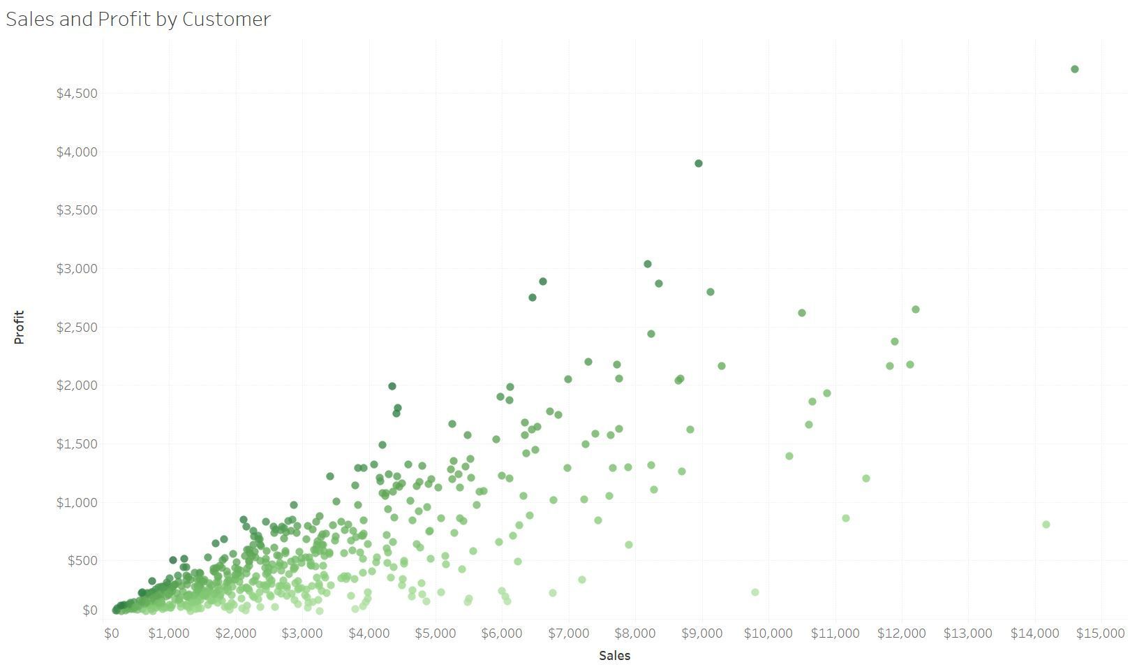
Scatter
If you have several datapoints and wish to see the distribution and correlation across multiple sets of variables, then a scatterplot can be very useful. Each datapoint is represented by a single mark on a standard X/Y graph. From there, a trend line (such as a regression) can be added to expose the relationships between the variables. For additional insights, those marks can be represented by different colors, shapes or sizes to distinguish other aspects of the data.
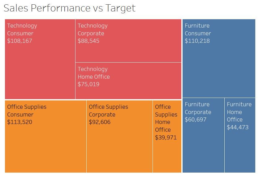
Tree Map
Tree maps are a simple way of illustrating the proportion of various categories and sub-categories to the whole. Each category is represented as a box which fills the appropriate area of the total space. Likewise, each subcategory fills a box according to its proportion to the category.
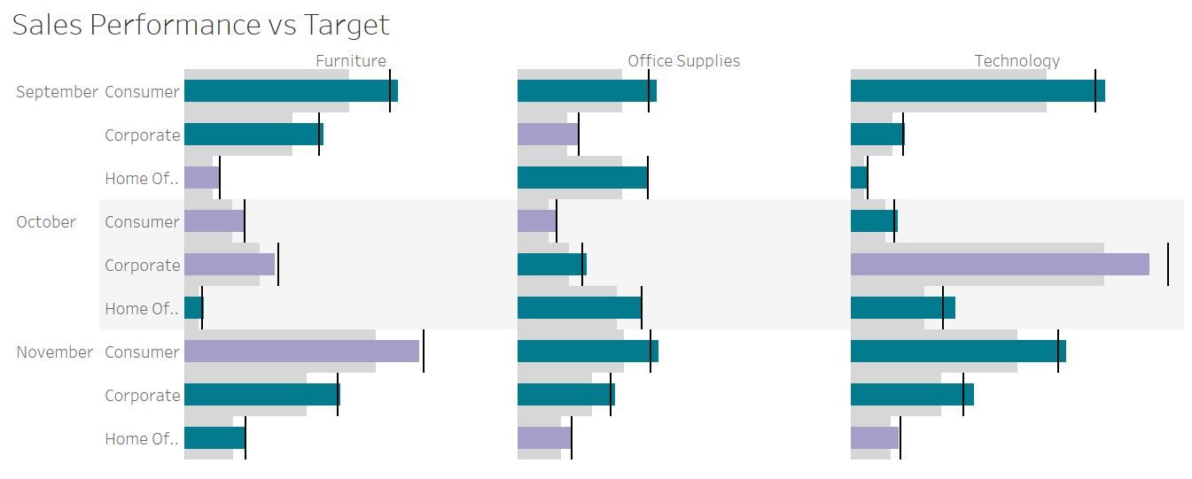
Bullet
A variation of the simple bar graph, a bullet graph is used to measure progress towards a goal. A bullet graph’s main components are a thin bar which represents the actual data, a thick bar which is segmented out to represent qualitative demarcations (such as: poor, good, excellent), and a target mark.
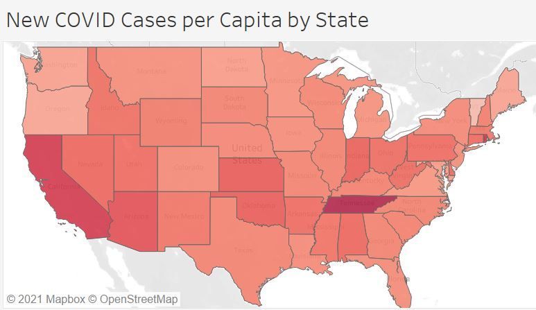
Heat map
By incorporating different shades of one or two colors, a heat map is useful in comparing values of datapoints across the whole dataset in one simple visual. These are typically used to add “color” to a simple text-table or to a geographic map.
This is by no means an exhaustive list as there are many other visualization types available. But as you can see from this list of common types, there is much to be gained by incorporating data visualizations into your reports.
The post Data Visualization Types appeared first on Fairdinkum.